
nametree: a design system that waited twelve years
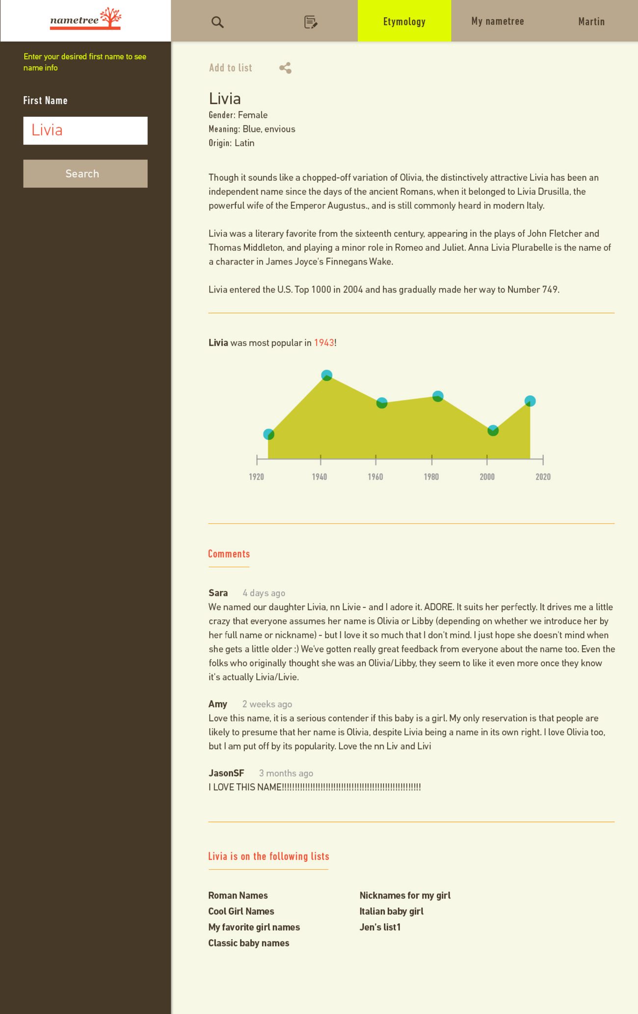
nametree reads a family’s names and finds the ones that belong. It began in 2014 as a set of concept mockups: a warm cream and coral palette, a serif wordmark with a small coral tree, and a name page built around meaning, history, and a popularity chart drawn from real records.
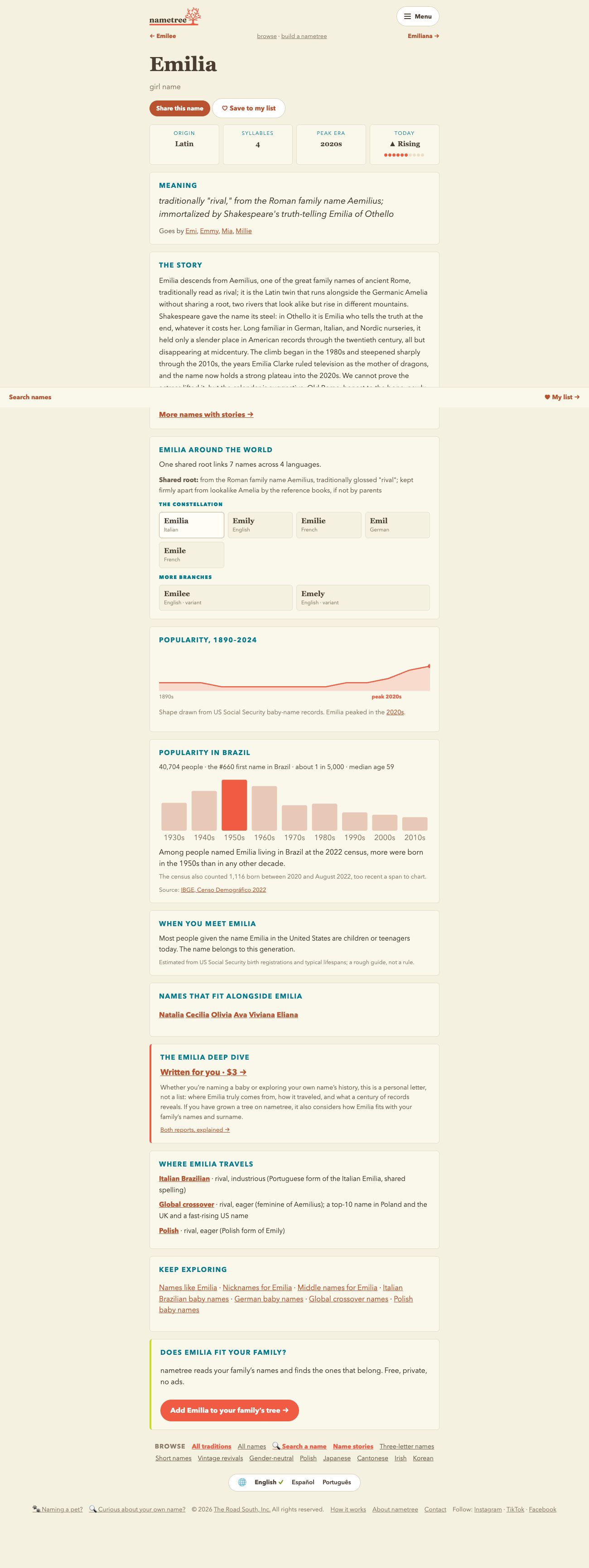
The product shipped in 2026, and the 2014 system held. The palette carried over directly: cream, coral, chartreuse, teal, and tan, straight from the original boards. The wordmark and the tree stayed. The name page kept its original anatomy, with the meaning up top, the story in the middle, and the popularity curve anchoring the page. The two images here are the 2014 mockup and the 2026 product, twelve years apart.
What changed was scale. One design system now covers a live matching app and more than 29,000 generated pages in English, Spanish, and Portuguese. Every card, chart, and button is emitted from a single set of rules, so a design decision is written once and lands on every page in three languages. Serif display type replaced the 2014 light sans, because at modern phone sizes the headings needed more presence. A two-coral rule keeps text accessible: a darker rust carries links and small controls, while the bright brand coral is reserved for each page’s single primary action.
The details carry the warmth. Popularity sparklines end in a peak-decade dot. Fit bars use a hatched print texture. Motion is quiet and respects reduced-motion settings. The paid reports are set like printed keepsakes, with a book cover, drop caps, and botanical stationery in the house palette.
Category: Product Design, UI, Visual Identity
Client: The Road South
Responsible For: Visual Design, Brand, Design System
Concept 2014 · Product shipped 2026, The Road South